Raffld
Part One: Launching the Experience Lottery
Product Case Study

In house at Lottovate - who build, launch and invest in new lottery businesses
Jess/Lisa (Project Manager) and Axel (Product Manager) along with myself (lead Product Designer), with intermittent freelance designers due to budget constraints.
Phase 1 - July to December - Beta Launch
Phase 2 - January to June - Full Launch
85% of the Dutch millennials value experiences over money
Problem
The current state of the lottery industry in the Netherlands has focused primarily on large cash prizes. However the market has an aging customer base and fails to appeal to a younger audience who currently have the lowest participation rate.
Our product will address this gap by taking advantage of a new regulation opening up in the market for charity lotteries and launch a purpose driven, social lottery product that fulfills the following customer needs identified in the product discovery:
“I need to escape”
help to check out of their day or distract them from boredom
“I need to connect with others”
customers look to strengthen connections with their social groups but don’t need help finding new ones
“I need to feel good about myself”
much of the behaviour reported across the research topics stem from a need to boost self-esteem
To be pioneers who disrupt the traditional lottery world by targeting a new generation of players who value experience over money
Spend a little money to buy into a big tangible dream of a fully bespoke trip with friends, while feeling good about themselves because they’re contributing to charity at the same time
Dutch millennials who are experience hunters, they could be described as:
- Curious and eager
- Friends centered
- In the know
- Free spirited
- Experience over money
- Giving to charity is a fun, positive experience
- A honest chance to win more obtainable prizes
Solution
Raffld - A social lottery web app in the Netherlands that runs a weekly raffle to win epic experiences for up to 4 people, donating half the price of all the purchased tickets to partner charities.
Background
Perceptions of Lottery
Key insights obtained during the product discovery revealed that “Lottery is seen as a form of gambling, even by those who play it”.
Barriers to Playing Lottery:
- Waste of money
- Low odds
- Lack of skill element
Negative Perceptions:
- Poor people play
- Old people play
- It is gambling; gambling is bad
Competitive Research
The two Big Players
There are two existing players that dominate the stable market in the Netherlands – Postcode Lotterij and Staatsloterij.
Both have big cash incentives to play. Postcode Lotterij has a very bold and brash UI that is alike many other traditional lotteries in appearance. Staatslotterij heavily uses orange throughout the UI which has huge cultural appeal in the Dutch market.

My Role
I led the design of the product from early prototyping through to launch and beyond. I joined the project after the product discovery phase was completed.
I worked very closely with the core team: Axel, product manager and Jess/Lisa project managers throughout and collaborated with 3 freelance designers at various stages of the project due to budget constraints.
Customer Insights & Ideation
I jointly ran usability tests to uncover insights and translated into features that addressed customer behaviours and motivations. Iterated the prototype and tested again. Repeat.
Oversight & Coordination
I liaised with a 3rd party web development company to build the WordPress side of project, overseeing build progress, time management of build and quality checking against supplied design.
Design Execution
I executed journeys, wireframes, prototypes, design specs, digital toolkits and brand guidelines.
Additional Resource
I was responsible for hiring and managing freelance designers when needed throughout the project.
The Process
This case study focuses on the key changes in the product life span up until the product launch in June 2018. The responsive web app is mobile first and therefore I will mostly show designs for mobile throughout.
NOTE: Lottovate hired Market Gravity, A Proposition Design Consultancy to carry out extensive research to identify the market opportunity, customer proposition and business rationale.
During this time they undertook 11 in-depth interviews, 300 ideas created 8 concepts taken into co-creation with 10 customers, 500 customers surveyed, 17 customer testing sessions, 6 prototypes later WeWin proposition was created.
Raffld part two case study goes deeper into the growth hacking process.
Phase One:
Working towards closed Beta
I joined the team after the product discovery was finalised and the first round of user flows and wireframes had already been produced. I was asked to skin the wireframes to ‘create the illusion’. As a lot had already been learned from the market, we believed we were ‘making the right thing’ but were we ‘making the thing right’.
We validated the proposed game mechanic and gained more insights using a prototype built in Invision.

Usability Testing in Amsterdam
Insights gained from our target users during usability testing confirmed our value proposition and provided direction to pivot the ticket structure. It also highlighted cultural influences that require additional features for MVP.
Usability Testing
Key Insights Learnt
Overall the participants had a very positive reaction to our value proposition.
- “I haven’t see any products like this”
- “I like it, it’s a really good idea”
- “As it’s a raffle I was expecting cash back, this is better because an experience is worth more than cash.”
- Testing the Proposed Brand Name
‘Raffl’d’ (later to become Raffld) was perceived well amongst participants. “I get a raffl’d feeling. It’s appealing. I’m not sure what it means. It’s exciting.”
- Prize & Charity
Donating to charity adds trust, and makes people feel good about themselves. “It’s good 50% of the purchase goes to charity. I did a good thing and I have a chance to win something”.
This was made very visually clear with 50:50 split between prize and charity on entry cards.
This was made very visually clear with 50:50 split between prize and charity on entry cards.

- Key Cultural Influences
Dutch lotteries run draws monthly rather than weekly so a subscription based ticket was tested. Each ticket contained 4 entries to 4 weekly draws playing for a prize category with different prizes every week. There was a mixed response from participants, some liked the spontaneity of new prizes others wanted to pick and choose the ones they wanted.
iDEAL for payment was a priority feature that needed to be added to MVP (minimum viable product) with 100% of participants tested, saying they would use it to purchase a ticket.
- Credit cards “lead to debt”
- “In Holland everyone would choose iDEAL”
- “I don’t have a credit card so would use iDEAL, it gives it more social acceptance”
- Confusions
Participants were often confused by groups and inviting friends: “What happens if I don’t share with friends who wins the prize? Will I still be eligible, can I still enter the raffle. If I win do I get to choose who goes?”
Iterations with a progress tracker to guide the user through the flow showed that:
5 steps is too many and highlights how many stages there are to purchase a ticket, the step label text was also too small to read
The 3 step tacker didn’t add any real value as the tracker was added at the sign up stage, at this point users expected the next steps.
The experimental progress tracker as an icon that fills sections as you progress to the confirmation page was unclear and just added visual clutter. It also gave the impression you had to play as a group.
The progress tracker was added, iterated and removed.
Early Challenges
Time & Resource Pressures
As we had such strict deadlines to launch a completely new product in the Dutch market we decided to seek the help from a brand agency based in Amsterdam. The reasons for which are twofold:
- The brand direction could evolve in parallel to product ideation and prototyping.
- The agency would have cultural insights into our target audience that we don’t have.


Supplied final brand book and deliverables were unsatisfactory but there wasn’t time to go back to the drawing board as the product would be at the risk. We had to take the best bits and move forward with what we had.
I created a moodboard using the best bits from the supplied brand book as the starting point for more inspiration.

Section focussed on colour blocks

Section focussed on highlight styles

Section focussed on line design details

Section focussed on layering
A strong studio photography style was outlined in the brand book with an emphasis on over acting and expressive emotions so we organised a shoot in Amsterdam using real groups of friends (not models) within our target age range.


In hindsight this photoshoot and image re-touching was a costly mistake but I’ll get to that later…
Non-Stop
Design & Build
Our in-house dev team worked in 2 week sprints so all design work was planned to accommodate this and not be a blocker potentially putting the product at risk of being behind schedule for beta launch.
However all the WordPress template pages had to be handed over in one go with extra attention paid to pixel perfection as inconsistencies or misalignment in the designs could cause disagreement when it comes to bug fixing and quality checking of the build.


In total there were 11 template pages and 103 screens for Wordpress integration uploaded to Zeplin. I also created a build document for the WP team of developers to use for reference.

It was a balancing act managing expectations from in-house & external development teams simultaneously
We had a strict deadline from stakeholders to launch by Christmas… and we did!
But before this we had a last minute request to set up free-form “show and tell” booths and showcase the Raffld product to the Supervisory Board.

“Huge kudos and shout out to Axel Guillemot, Prem Kumar, Jess Tayenjam and Sarah Thomson for being such amazing advocates for Lottovate.
The board members were impressed with everything they saw. They got to play the games, hear about the licensing process, understand how the draws operate, and see the powerful tech and product differentiators that we’ve created. Well done, everyone!”

In early versions of the design iteration process there was a conscious effort to be removed from anything resembling lottery or lottery tickets due to the negative connotations and attitudes it evokes. As outlined from 11 target users in 1 hour in depth interviews, lottery is seen as a form of gambling, even by those that play it.
Phase Two: Test, Learn, Iterate
From Beta to Full Launch
Closed beta was tested with selected friends and family (those with a Dutch bank account) to buy tickets for €1 and play to win experience packages in the Netherlands. Beta was used to iron out any problems with running the draw machine.
Key User Pain Points
- Inviting Friends
Feedback from closed beta showed emphasis on sharing with friends and forming groups to win together over complicated things, users felt they had to play with others and could not play individually. It was more important to increase the numbers through the top of the funnel first so this was put on the back burner to iterate, test and learn at a later stage.
- Prize & Charity Donated need to be re-evaluated
Choosing a charity was also highlighted as another pain point that caused too much indecision and a barrier to purchase. Therefore we added functionality to choose “support all” charity partners and simplified the flow by removing the specific charity page in favour of one charity page for all charities with expanding content sections.


Charity landing page
Charity partner page

Charity page
Charity page (expanded)

NOTE: The design is stripped back removing the hero image that took up a lot of vertical real estate. The content for each charity was refined and the charity's contribution figures were made more visual in the form of a pie chart.


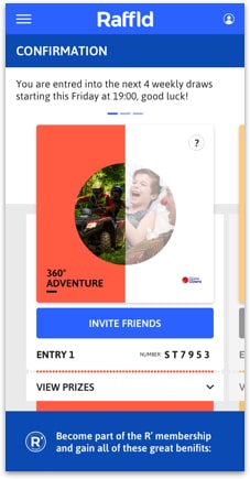
NOTE: The 'support all' functionality meant that a single charity image couldn't be used within the right hand half circle on the ticket card for Confirm Entries, Confirmation and My Game Plays pages. Therefore losing the effect of the 2 choices the players pick (prize and charity) being combined together to form the ticket.
Charity is important but perhaps not as important as participants made out in usability tests and user interviews. It's possible that it's how they want to be perceived.
Observations suggest that choosing a charity is dependant on the level of emotional response to the charities, if the response is low to all, then it's just another step in the way of buying a ticket.
Mistakes
Made More Impact
In the rush to get a Beta product launched we forged ahead with the branding direction we had at the time, unfortunately this didn’t come with strong brand positioning. Therefore we sought the help of a new Dutch creative agency.
Raffld’s competition is the traditional lottery that focuses on winning money whereas with Raffld:
To further stand apart in the industry we needed the messaging to communicate our descriptor in a disruptive way.
The campaign message was certainly impactful and took awhile to sit with a few stakeholders however culturally the word isn't as strong as it would be in the UK. The campaign message will all be written in English rather translated into Dutch.
We took it one step further and replaced the asterisk with the existing branded apostrophe used with in the single R icon.

For Launch it was all about creating impact
But
Our photography style of overacting and expressive emotions didn’t work alongside this impactful campaign messaging, we needed to re-visit the brand. Unfortunately the costs spent on the photography shoot and time editing the images would most likely have to be written off.
New Inspiration
Travel Tickets
The messaging helped us refocus and define a stronger brand identity. We thought more about the type of experiences and destinations that were Raffld prizes, all involved travelling abroad. Even though we didn’t want to have any visual associations to lottery and lottery tickets we could make the connection to travel tickets.


The colour palette was re-evaluated and refined

Typography using Asap font for general copy

Asap Condensed was added for punchy titles

Passport stamps inspired the R' Member & R' Winner stamps. Inked effect and vector styles were created

Category specific design elements including icons, individual barcodes and category title lock-ups

Ticket detail example containing category specific design elements with new category images
Iteration Version 1
Iteration Version 2
Iteration Version 3


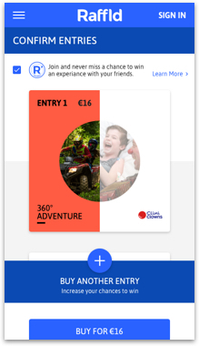
NOTE: The buy button on the 'Confirm Entries' page was made larger and more prominent in orange and the subscription tick box was moved just above it for better visibility. The third iteration of this page also negated the need for an onboarding overlay to edit the ticket as there is now a text button. I describe more about the evolution of the visual design elements further down in this post.
Iteration Version 1
Iteration Version 2
Iteration Version 3


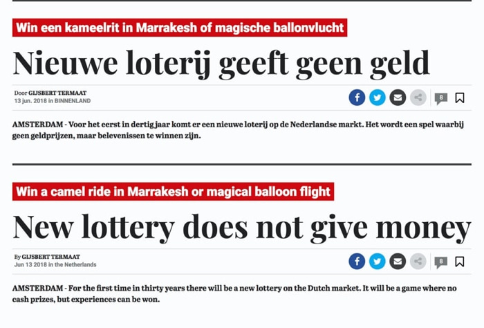
Raffld successfully launched on time in June 2018 as the first product to launch in the Netherlands lottery market for nearly 30 years.


On Reflection
Final Thoughts
Launching Raffld has been very challenging especially for me in times of design bottlenecks without the budget for additional resource. I had to constantly remind myself to keep the big picture in mind and not get too bogged down in the small details as it’s more than likely to change when we test, learn and iterate over time.
However and arguably most importantly, it’s been really fun and innovative changing the traditional lottery model.
As a team we learnt a lot, unfortunately some of the mistakes learnings were quite costly to the project budget. Most notably having our eyes firmly fixed on launching Beta, missing the vital messaging proposition which would further stand us apart in the industry. Followed by the discovery that our new disruptive messaging didn’t quite work with the images from the photoshoot. In this instance the content should have come later.
I underestimated how many cultural insights we would find whilst working on a Dutch product, I presumed that apart from the language they were culturally very similar. On the surface they are but when you dig a little deeper there’s much to be learned.
The Raffld story continues read Part Two: How might we increase Raffld’s ticket sales whilst keeping the cost per acquisition low?
