Raffld
Part Two: How might we increase Raffld’s ticket sales whilst keeping the cost per acquisition low?
Product Case Study

In house at Lottovate - who build, launch and invest in new lottery businesses
Lisa (Project Manager)
Axel (Product Manager)
Emilija & Sharona (Marketing)
Doogal & Lizi (Developers)
Myself (Lead Product Designer)
Shortly after launching Raffld, Lottovate carried out a company restructure splitting the wider teams into small product specific teams to operate ‘like’ a Startup with budget dependant on KPI’s.
Phase 3 - Post Launch June - October 2018
Read Part One: Launching the Experience Lottery
4 out of 5 Dutch millennials find beautiful experiences are more special if they can experience them with others
Raffld
A social lottery web app in the Netherlands that runs a weekly raffle to win epic experiences for up to 4 people, donating half the price of all the purchased tickets to partner charities.
Problem
Raffld has declining ticket sales after the impact created during the product launch. We have also observed significant bounce rates and poor conversion from marketing ads.
This is causing financial loss to the business as each week a trip is won, worth €6’000. How might we improve Raffld to reduce the bounce rate at the top of the funnel, increase brand awareness and in turn lead to more ticket sales.
Dutch millennials who are experience hunters, they could be described as:
- Curious and eager
- Friends centered
- In the know
- Free spirited
- Experience over money
- Giving to charity is a fun, positive experience
- A honest chance to win more obtainable prizes
Phase Three:
Post Launch
We’ve launched... but now what? No one knows who we are.
To increase adoption and frequency rates, gain brand awareness and build trust within our target audience of dutch millennials aged 22-36 we partnered with Domino’s (who doesn’t love pizza) giving away a free ticket with every pizza purchased over €15.
To comply with regulations in order to give away free tickets, choosing a charity functionality had to be moved post purchase. This change was a twofold benefit:
- A great business decision as it enabled free ticket giveaways without costing the business anything.
- It was one less step in the purchase flow.


NOTE: This flow illustrates a 360° Adventure ticket is chosen, a returning user can sign in with credit in their account to purchase a free ticket (from Domino's) or a new user can register and use iDEAL to pay. Please note: there are bank specific screens missing from the iDEAL section of the flow where the user is redirected to their bank before being directed back to the Confirmation page.
From this page users can then choose a charity to donate 50% of any paid for ticket, if no charity is selected the donation amount will be shared equally among all charities as default. Alternatively users can select a charity at a later time (as long as it's before the first draw) by selecting "all entry information" on the My Game Plays page via the my account menu.
Test, Learn & Iterate
We carried out another round of usability tests on 5 Dutch participants that fitted our target audience living in london too keep cost low. They were all completely new to the product as all marketing was only in the Netherlands.
Findings from these tests proved that moving 'choose charity' to post purchase worked well and users expected it to be there.
We also implemented mouse flow to observe our existing user’s behaviour throughout the web app to discover pain points.
Two of the biggest learnings observed were:
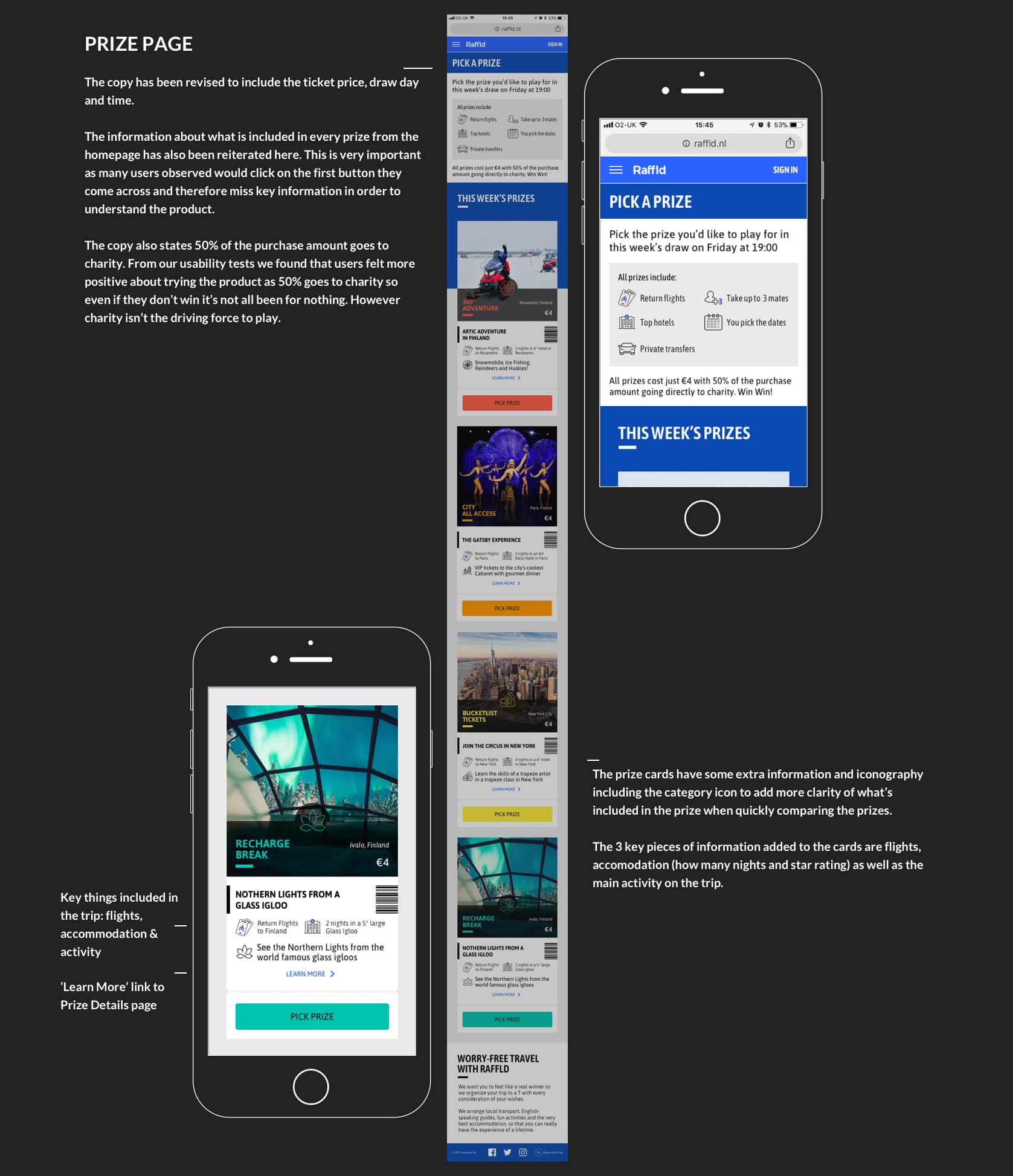
1. Endless Loop Comparing Prizes
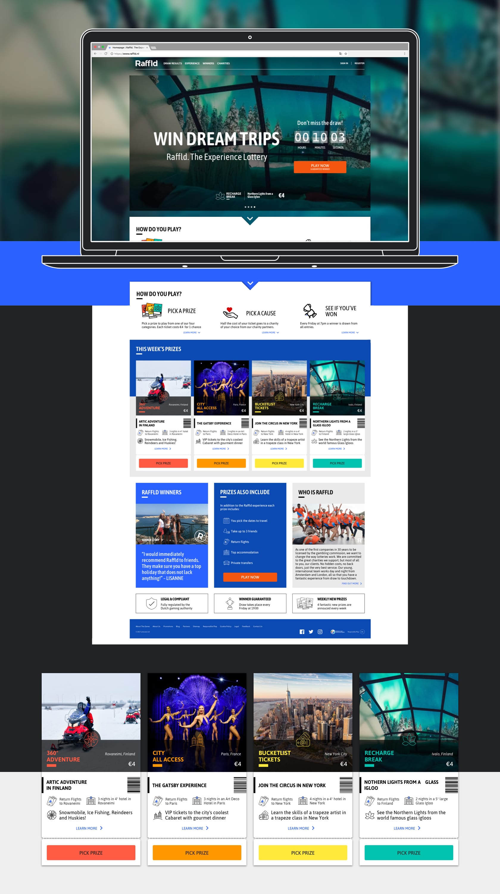
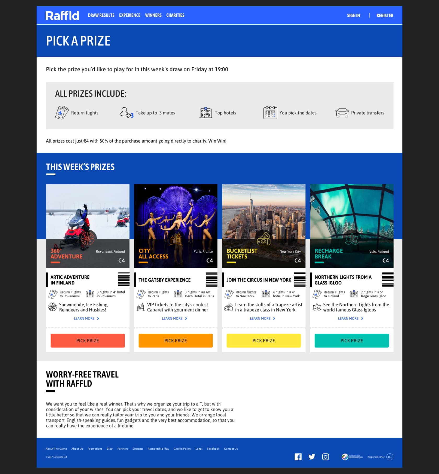
The amount of time a user would spend going through the current prizes (4 categories each with 4 prizes = a possible 16 prize pages) comparing them against each other and dropping off before purchasing a ticket, too many options causing indecision.
This is backed up with a participant saying "I would check all 4 categories before deciding".


NOTE:This issue is more apparent on mobile with 4 extra screens for each category, whereas this content is at the top on desktop screens. We needed to find a solution where Raffld players could compare the core details of each prize quickly without having to read every detail, dramatically reducing the time it takes to make a decision and buy a ticket.
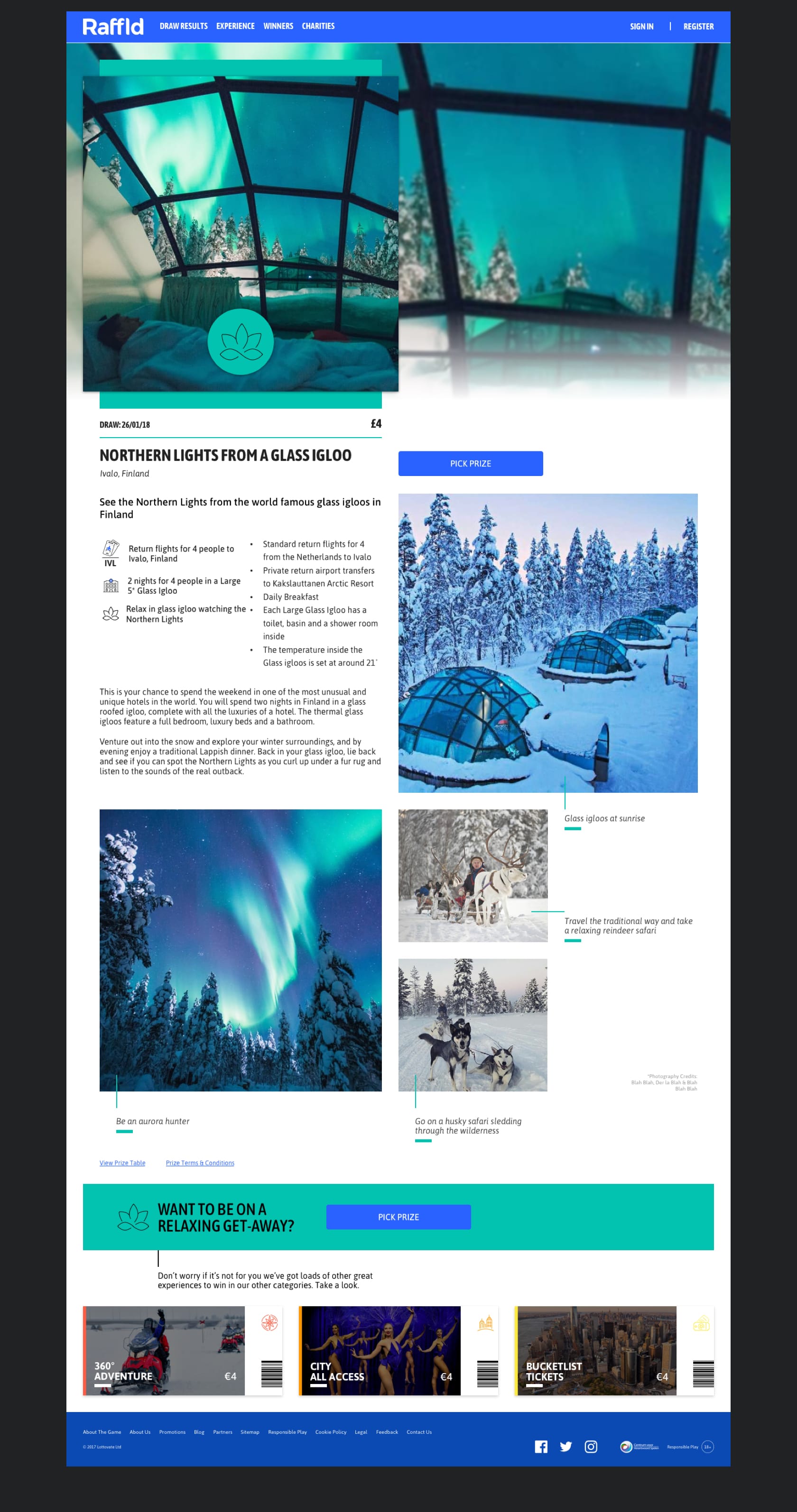
2. Read More on Results Page
It was interesting to see how important the result page is for new users to see previous prizes won. One user observed using mouse flow got very frustrated clicking all over the page in the hope to see more information about the prizes.
We weren't making the most of the content we had to help engage new users and encourage them to play. An index of past experiences as a type of catalogue could also be used to increase SEO ratings and link to winner’s stories.

Note: ‘Full Results’ link would only be present if more than one prize was given away, this includes small non experience prizes.

For this concept we also considered linking to prizes that didn’t win in the draw that week. Therefore all prizes would be indexed on the site.
To compare against our qualitative data gained from user testing we also carried out serval quick and dirty experiments using landing pages built using Unbouce to A/B test our assumptions on the price point being too high and that our users don’t want to play for 4 different prizes at a time but pick and choose the prizes that interest them the most.
"I'm a bit confused now. I thought they mentioned you pick a prize and play for that but now I see it's different... I would rather pick one and play for that prize."

From the data obtained from the various types of tests conducted we put forward a business case to completely restructure both the pricing and the core purchase flow to play weekly for 1 prize instead for monthly for 4 different prizes.
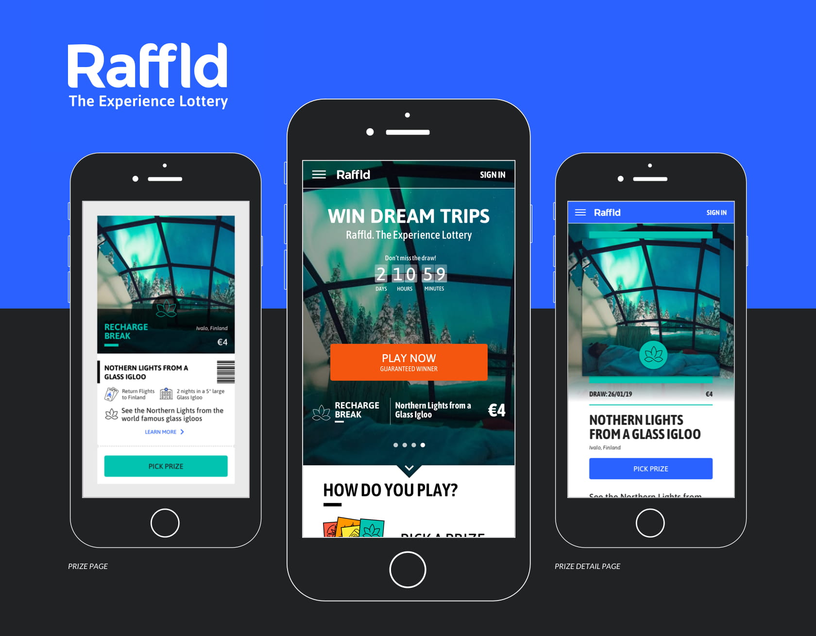
The Refinement
Simplify the Flow to 1 Week
Play to win 1 prize from 1 draw with a lower ticket price of €4.
Prize categories remain as they are a core component for the subscription model however players subscribe weekly rather than monthly. We removed category images as this caused confusion during usability tests with users associating the image with the prize they are playing for.

NOTE: This document contains final deliverables in a very comprehensive flow where you can pick any of the 4 prizes, add and edit a second ticket from any of the 4 prizes (this then needs to be removed to progress in the flow). Sign in and pay using a saved account in iDEAL before choosing a charity.
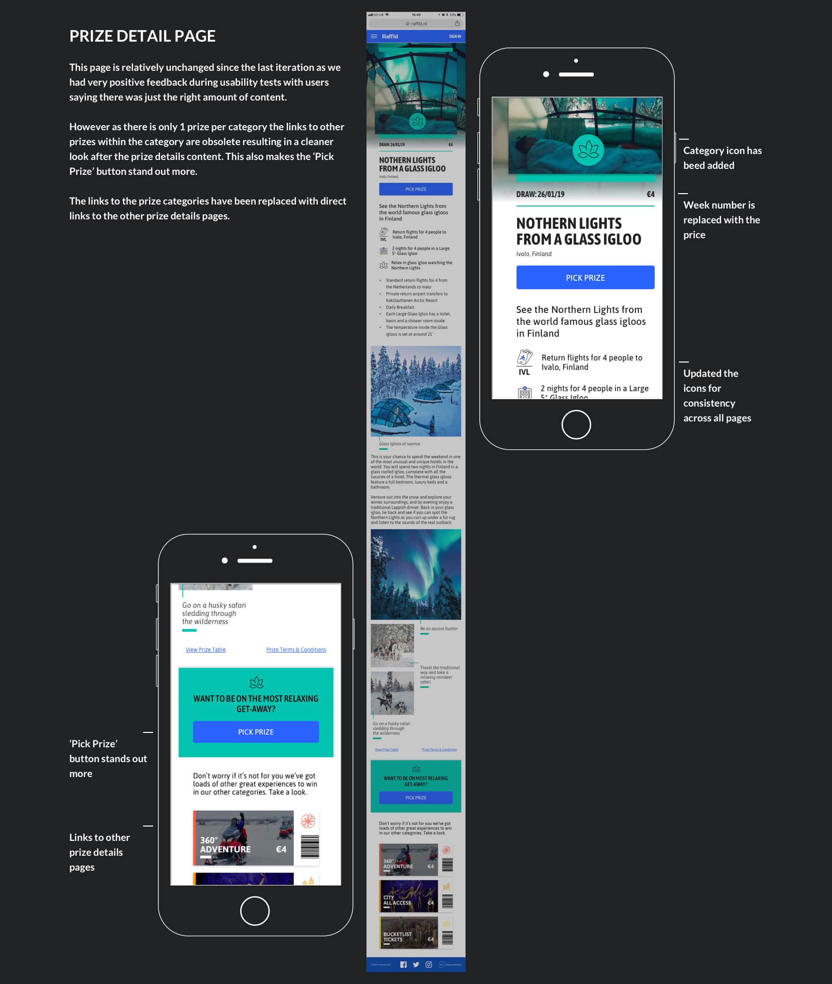
The Details
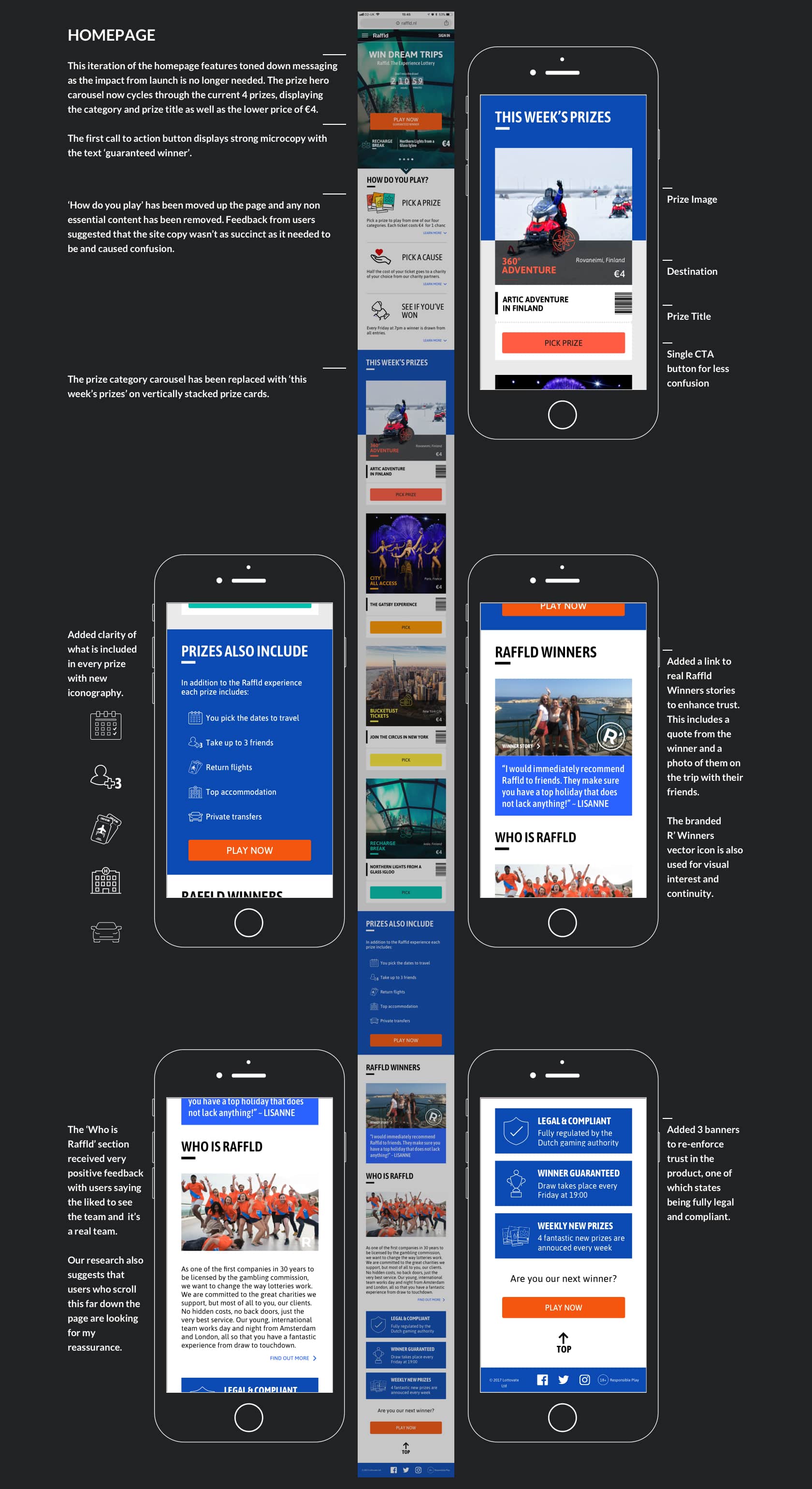
Simplfied Yet More Specific
The latest product iteration has stripped away a lot of the the confusion brought about by playing for more than more prize at a time. This simplified version can be very specific about the prize for each of the 4 categories for example, adding the prize titles and images in the carousel on the homepage hero. As well as adding clarity and easy comparison as to what is included by displaying the 3 key pieces of information about the prize: flights, accommodation and main activity on each of the prize cards.
The Impact
The Outcomes from 1 Week Product Pivot
By reducing the cost per ticket from €16 (4 draws over 4 weeks) to €4 for 1 draw meant that the improvements to the user experience increased both acquisition and retention.
There was less confusion for users over the prizes they would be playing for as only 1 prize image was used in targeted ads. This also meant that the bounce rate reduced as the prize content was as expected.
Award Nominations:
Nominated for the in house product of the year - EGR Operator Awards 2018
Nominated for excellence in innovation - Corporate Entrepreneur Awards
On Reflection
Final Thoughts
It is often said and the importance of which cannot be underestimated, you don't truly learn about the product until it's in the market with real users making real life decisions. The iterations we've made to the product since launching have made a very positive impact although there is still much to learn and improve on. However if this product is going to succeed in this dominated industry I believe two of the most important customer engagement metrics will be retention and referral.
Unlike cash incentive lotteries the prizes vary greatly week on week. We discovered a direct correlation between certain experience trips and a peaks in ticket sales for that category which suggests the types of prizes and more specifically the destinations play a crucial factor in the products desirability.
On a personal level, my biggest learning from this project is to keep a regularly updated diary of the key moments during the product life cycle as so much has happened.
UPDATE: Since leaving the company Raffld has been shelved, however 144 epic experiences were won making memories for those lucky winners!